Chomps!
Overview:
Chomps! was inspired by one of my favorite local restaurants that opened in the 70's. They have kept everything the same since they opened, including that you can only order in person or by calling. They don't have a digital footprint outside of online reviews on Google & Yelp, and I always wondered what I would look like if they took a step into the modern era.
My Roles
-
UX Designer
-
UX Researcher
-
Brand Development
Responsibilities
-
Develop branding material & guidelines
-
User Research & Consultation
-
Site Design & Development
Duration
4 Weeks - May '25
Problem:
Chomps! was looking to build a mobile site for its customers to order online and on the go. Their staff has been getting bogged down with taking orders, so implementing this tool will allow them to pay more attention to patrons & provide better customer service.
Solution:
Chomps! wants to gradually dive into the digital space, so we will be starting them off with a mobile site as it is the most affordable and accessible option. Their customers will be able to order from home or on-the-go, and employees with have more bandwidth to provide customers with a better in-store experience.
How It Came to Life!
Colors - Chomps! is most famous for making the best burgers & wraps in town, so we wanted to select a color scheme that made first timers want a burger before they even looked at the menu.

Typography - Chomps! takes great pride in it's deep history in the community, so we made sure to give them a classic & bold font to represent their impact on the community and paired it with a clean & easy to read font to make life easier for users.

Wireframe / Lo-Fi Model
After conducting our initial research (learn more about my design process & research methods in my About Me page), we learned that the average user isn't the most comfortable with technology, but can easily accomplish basics tasks. With that in mind, we wanted to construct a user journey that was simple and easy for users to navigate through to complete their orders and join the loyalty club to help increase customer retention.

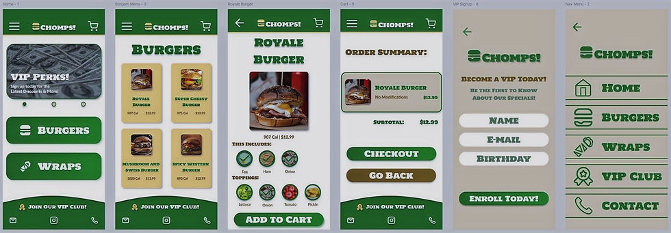
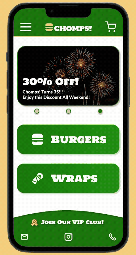
Mockups & Hi-Fi Model
Thanks to usability studies conducted, we were able to identify issues with verbiage, product/option image sizes, text legibility. Thankfully we were able to make the necessary adjustments to complete our Mockups and finalize our Hi-Fi Model!
We were able to create a mobile site which met the company's goals of being user friendly to free up their staff to provide customers with a better in-store experience, and we created another avenue to attract attention to their loyalty program! Users were happy to have more accessibility on how they could order & interact with Chomps!, as well as having time saved when submitting an order, and easier access to signing up for their loyalty club!


Takeaways:
To see how users went from providing feedback filled reviews during the Lo-Fi testing, to appreciating the design and functionality of the site after the Hi-Fi testing was truly inspiring. One user even stated “I wish this restaurant was real, so I could order now!”
Next Steps
Integrate ETAs for when orders will be ready, so clients can arrive when their orders are ready.
Develop the Loyalty Club from the current email list for promos to a points system for users to earn rewards & show them their progress.
Add the ability to order from multiple locations as the business grows and expands.