
Chris Cava
Overview:
Chris is looking to update to his website to be more light, inviting, and professional. His current site only displays him as a performer, but he now offers services for studio session & he is now an instructor, and he would like for his site to reflect with.
My Roles
-
UX Designer
-
UX Researcher
-
Brand Development
Responsibilities
-
Develop branding material & guidelines
-
User Research & Consultation
-
Site Design & Development
Duration
4 Weeks - August '25
Problem:
Chris’s current site was created with a dark and grungy feel to it and it only highlighted his services as a performer. It sporadically promoted his social media and music streaming presence as well. Seeing how he now provides teaching & studio session services as well, he needed his site to better promote himself.

Solution:
We set out to help build a site that helps highlight all of the services he offers and give users better access to his streaming and social media presence.
How It Came to Life!
Colors - Chris wanted a site that felt light & inviting. He wanted his new site to incorporated earth tones & have them paired with green to represent his growth and the growth his students will have after learning with him.

Typography - We wanted to pick fonts that would help represent Chris's calm and collected nature, his clear and direct teaching style, as well as his smooth performances.

Wireframe / Lo-Fi Model
After conducting our initial interview with Chris and user research (learn more about my design process & research methods in my About Me page), we learned that the average user ranges from adolescents/young adults who are fans of his music to middle-aged & older adults who are also fans of his work, and would like to book him for an event or studio session.
Knowing this, we made the decision to build a site that was clean an presentable for all & take a more professional approach than his previous site. We wanted to learn from the previous site to ensure that this version was warm, inviting, and made it easy for even new users to identify Chris's services & jump to sites that streamed his music with ease.

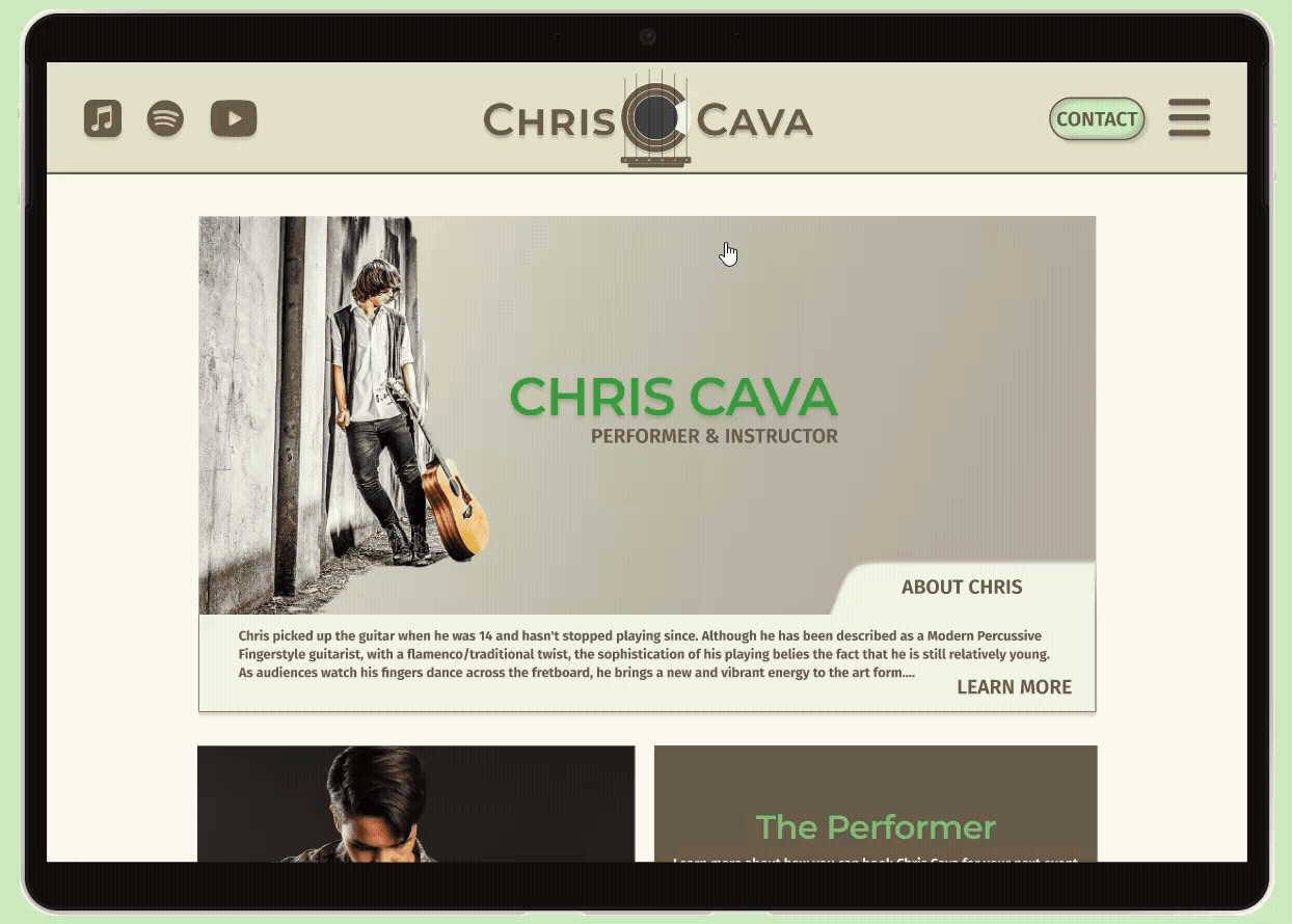
Mockups & Hi-Fi Model
Early testing and interviews with users after initial models helped us realize that we went a bit too light on content & over simplified things which caused ambiguity for users while navigating the site. We also had some missed opportunities when it came to implementing CTAs which we were able to correct going forward.
We kept simplicity at the forefront of our evaluations and revisions throughout the site. We were able to create a website that helps highlight Chris’s brand and services provided. We were able to successfully implement CTAs for users to contact Chris and enjoy his media throughout the site. The user flow has been coming across as intuitive to users as well.

Takeaways:
Chris now has a site that better displays his services and promoting his streaming avenues. One of the biggest takeaways from this project was the importance of making sure every click served a purpose. This site was a unique experience as it also serves as an outlet to help improve Chris’s digital footprint as well.
Next Steps
As Chris’s business clientele grows we can implement a calendar/scheduling feature to help schedule and streamline introductions with new prospects.
Investigate to see if his following tests well with social media interaction. If so, we can incorporate recent posts to the site.
Should business grow to where there is a need for an online portal for clients to view appointments and more, we can build in a login feature on the site to make the site a one stop shop for users before and after conversion.